
In the previous post the process for preparing your TopoJSON file from ESRI .shp files was outlined. The following steps will guide you through the process to load and interact with your TopoJSON file.
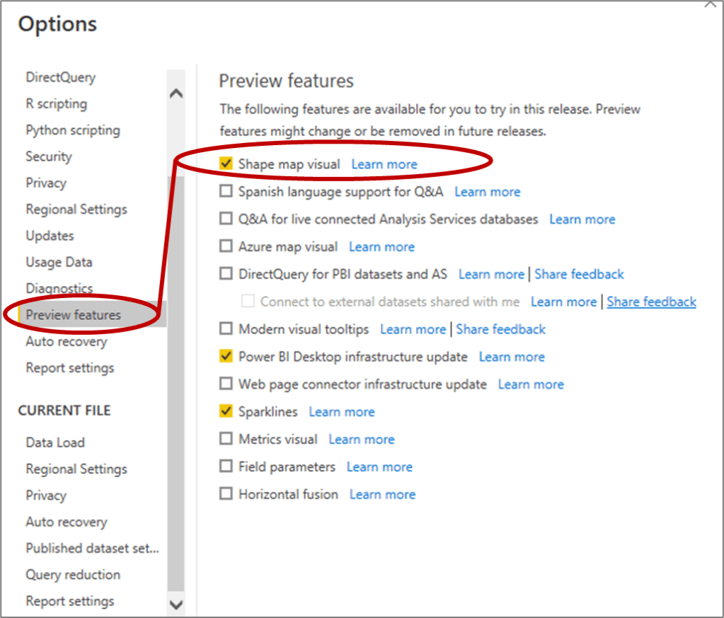
- In Power BI, the “Shape Map” is included as a Preview Feature. You can activate it by clicking on “File” then selecting “Options and Settings” and then Clicking on “Options”. This will open up the following dialogue box where you can select the “Preview Features” tab and click on “Shape Map visual”.

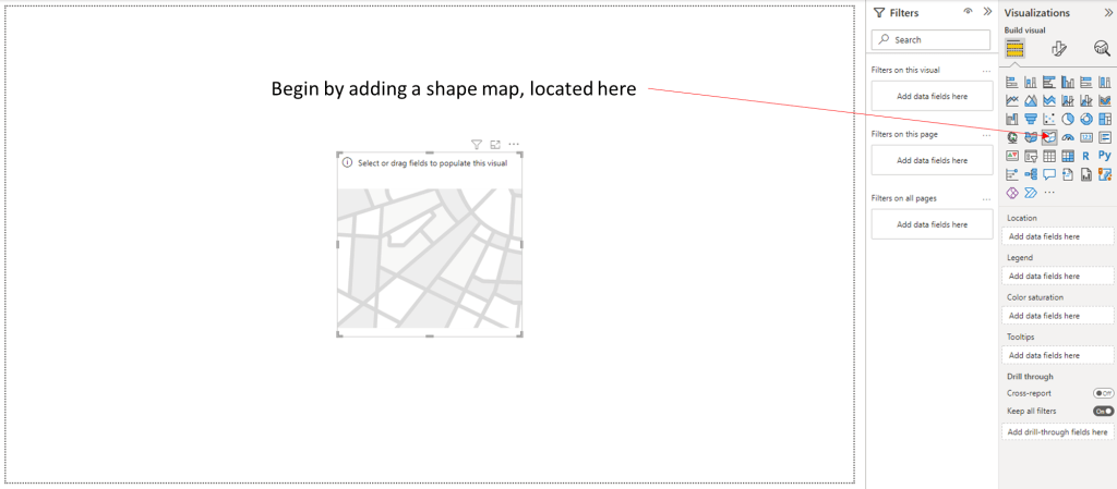
2. Click on the “Shape Map” icon which looks like this:
from the Visualizations pane to add the visual in your Power BI Report.
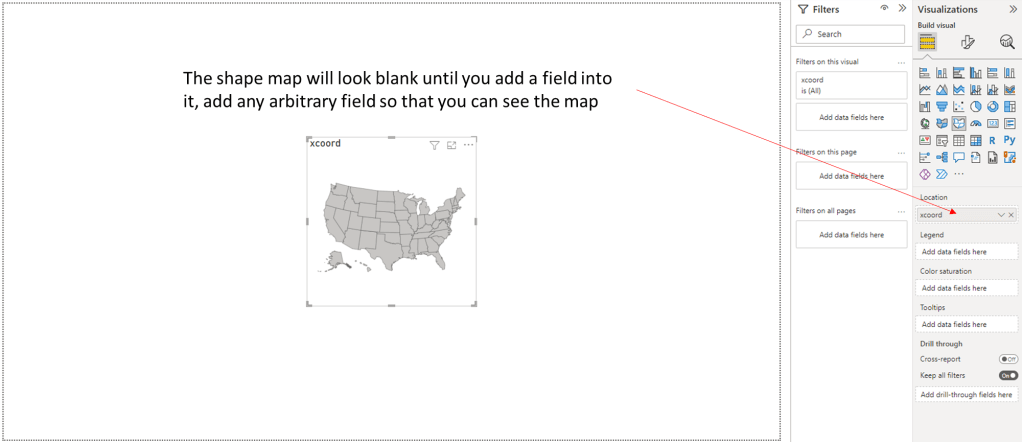
3. In the “Location” dialogue box, drag and drop a field from one of the tables you have already loaded. It doesn’t matter which field you select, you just need a field to be selected so you can get to the next step and load the TopoJSON file.
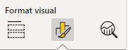
4. At the top of the Visualizations pane, click on the middle “Format visual” icon:
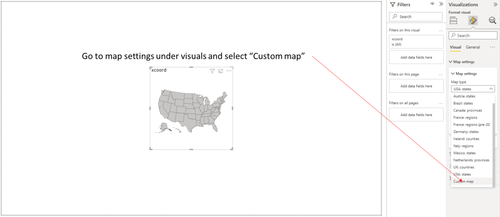
Then click on the “Map Settings” and scroll down to the bottom and select “Custom map”
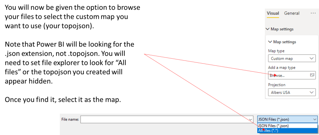
5. Click on “Add a map type”, click on “All Files (*.*) and browse to the location of your TopoJSON file and select it.
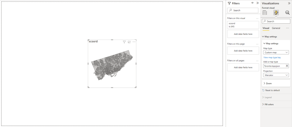
6. At this point, you should be able to see your map in Power BI:
6. Now that your map is loaded, you you can load additional files into Power BI and use their fields to color code your map with the “Colour saturation” setting
Make sure you take out the arbitrary field you added to see the map, and add in the field that is more appropriate for your project.
Additional Consideration
It is important to note that although the Power BI is able to display all of the Dissemination Areas (DAs) in Toronto, there is an upper limit on the number of shapes that it can color code. Depending on the geography you are working with, you may need to think of your area in sections to be able to display your color coded data appropriately.
