-
EMGFlow: A Python package for EMG signal processing.
Over the last year, I have had the opportunity to work with EMG data, performing signal preprocessing and feature extraction. During this work I found many of the workflows were less flexible than we needed and that there was a larger variety of algorithms described in the literature than were available in existing toolkits. EMGFlow is a compilation of these functions that have drawn from the literature, organized into modules, and made available as a flexible workflow using Python data structures.
As of this post, EMGFlow includes 32 different feature extraction algorithms for basic aggregation, advanced temporal features, traditional spectral features and experimental spectral features. The package was made available on Pypi (https://pypi.org/project/EMGFlow/) for public use on February 3, 2024 and has 6,430 downloads. This project is also available on GitHub (https://github.com/WiIIson/EMGFlow-Python-Package) and includes rich documentation that outlines all the source citations, equations, descriptions, and examples of use for each algorithm and function included in EMGFlow.

-
2021 On-Marg Index and onmaRg Updates Now Available
On-Marg Index Update
On July 14th, Public Health Ontario posted an update to the Ontario Marginalization Index with the 2021 dataset. This update included a change to the names of the dimensions:
- The “Residential Instability” dimension is now “Households and Dwellings”
- The “Material Deprivation” dimension is now “Material Resources”
- The “Dependency” dimension is now “Age and Labour Force”
- The “Ethnic Concentration” dimension is now “Racialized and Newcomer Populations”
These new titles were developed through community consultations across Ontario, and is a move away from deficit-based language. https://www.publichealthontario.ca/en/Data-and-Analysis/Health-Equity/Ontario-Marginalization-Index.
Stats Canada Update
The 2021 administration of the national census included updates to the census geography shapefiles. These changes include:
- Renaming column names to include both English and French acronyms.
- Removal of other geographic labels and creation of a new resource that contains the naming conventions for each level of geography.
onmaRg Package Update
To support the easier access and use of these datasets, the onmaRg package has been updated on CRAN to include both of these datasets, and continues to support the datasets from previous years: https://cran.r-project.org/web/packages/onmaRg/index.html.
These changes include:
- An update to the om_data() function to accept 2021 as a valid year.
- An update to the om_geo() function to accept 2021 as a valid year.
- An update to the 2016 parameter to access the new location of the 2016 On-Marg Index.
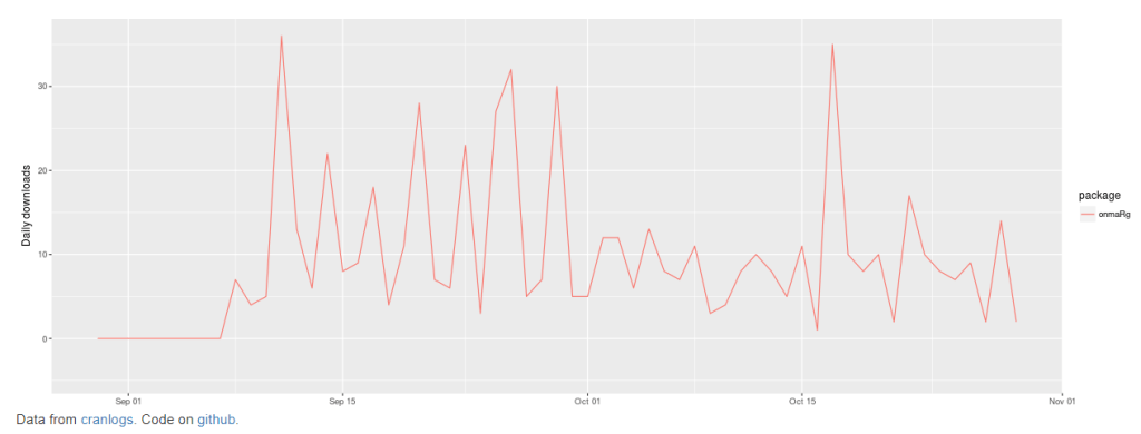
Many thanks to those that are including the onmaRg package as part of their workflow. As of this morning, the onmaRg package has been downloaded 2409 times: https://hadley.shinyapps.io/cran-downloads/.
If you are interested in getting started with the onmaRg package, a walk-through video is available here: https://www.youtube.com/watch?v=vjxrS1Wo4vc.
Also, if you are including onmaRg in your workflow and have a request or suggestion for a feature or function, please feel free to reach out.
-
onmaRg Video Tutorial
A tutorial video is now available on Youtube that demonstrates the features of the onmaRg package for R: https://www.youtube.com/watch?v=vjxrS1Wo4vc
This video is a useful resource for learning about the onmaRg package in action, rather than just reading about it in documentation. The tutorial walks through the functions to load, filter and visualize data from the Public Health Ontario’s “Ontario Marginalization Index (On-Marg)” and Statistics Canada’s geographic boundaries for Ontario. Whether you are new to R or an experienced user, this video is a useful resource for getting started working with this data.
Although not included in this video tutorial, the onmaRg package has been updated with a new function to re-calculate quintiles of On-Marg Index dimensions based on filtered geographies.
-
The Ontario Marginalization Index meets CRAN
Over the summer I had an opportunity to work with the Ontario Marginalization Index which is a data model that has been developed and maintained by Public Health Ontario and the Centre for Urban Health Solutions at St. Michael’s Hospital. This data and supporting resources are publicly available on the PHO website. Using R, I downloaded this data along with shape files from Statistics Canada and created a tool to explore socioeconomic issues with interactive maps. My initial development of this tool was as an R Shiny dashboard. However, I replicated and expanded on this work in Power BI.
At the end of August I consolidated my R scripts into a set of functions and created the onmaRg package which was accepted by CRAN on September 8, and has been available for public use for almost two months. In that time, it has been downloaded 572 times (as of today), and is currently ranked 18362 of 18773 available packages in the CRAN ecosystem.
Resources that provide guidance on how to use the R package will be shared soon.
-
Adding Your Own ESRI Shape Files to Power BI: Part 2 Loading the Data into Power BI
In the previous post the process for preparing your TopoJSON file from ESRI .shp files was outlined. The following steps will guide you through the process to load and interact with your TopoJSON file.
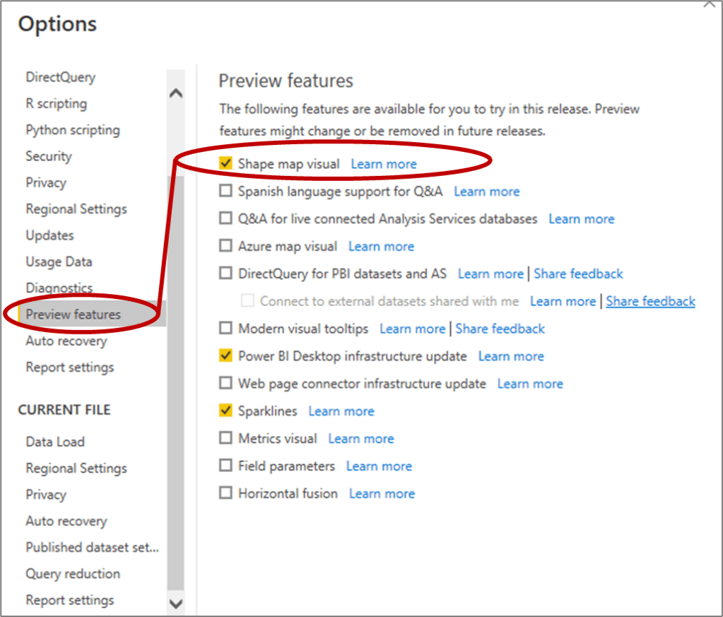
- In Power BI, the “Shape Map” is included as a Preview Feature. You can activate it by clicking on “File” then selecting “Options and Settings” and then Clicking on “Options”. This will open up the following dialogue box where you can select the “Preview Features” tab and click on “Shape Map visual”.

2. Click on the “Shape Map” icon which looks like this:
from the Visualizations pane to add the visual in your Power BI Report.
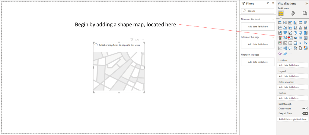
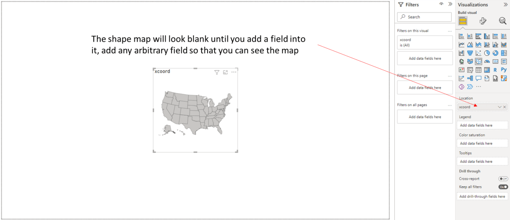
3. In the “Location” dialogue box, drag and drop a field from one of the tables you have already loaded. It doesn’t matter which field you select, you just need a field to be selected so you can get to the next step and load the TopoJSON file.
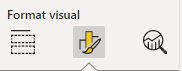
4. At the top of the Visualizations pane, click on the middle “Format visual” icon:
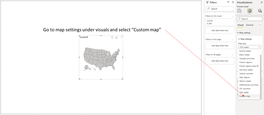
Then click on the “Map Settings” and scroll down to the bottom and select “Custom map”
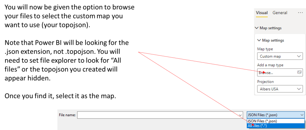
5. Click on “Add a map type”, click on “All Files (*.*) and browse to the location of your TopoJSON file and select it.
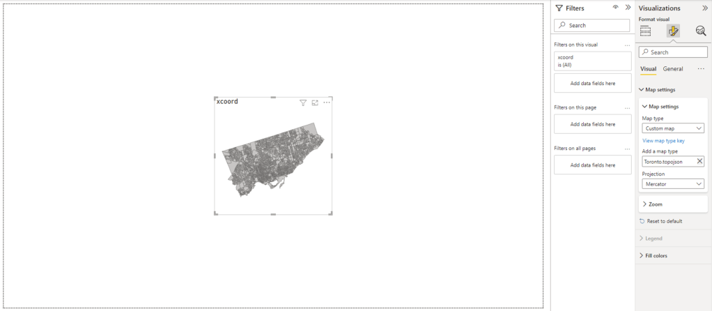
6. At this point, you should be able to see your map in Power BI:
6. Now that your map is loaded, you you can load additional files into Power BI and use their fields to color code your map with the “Colour saturation” setting
Make sure you take out the arbitrary field you added to see the map, and add in the field that is more appropriate for your project.
Additional Consideration
It is important to note that although the Power BI is able to display all of the Dissemination Areas (DAs) in Toronto, there is an upper limit on the number of shapes that it can color code. Depending on the geography you are working with, you may need to think of your area in sections to be able to display your color coded data appropriately.
-
Adding Your Own ESRI Shape Files to Power BI: Part 1 Converting to TopoJSON
Although the generic maps available in in Power BI are useful, sometimes you have a project that uses its own geography. If you are working with ESRI or other shape
file formats, Power BI has a visual called “shape map” that gives you the capacity to add your own maps to a report, so you can show and interact with your data by area. The advantage of the shape map option is that you do not need to have an ESRI license. You do, however, need to format the .shp files in a particular way to make them accessible. This article provides a step-by-step walk through to get the benefits of your own geography in Power BI reports.
Getting the Correct Files
To begin, you will need a the shapefile and csv for your map. The shapefile will be used for the actual map, and the csv will be used to represent data on the map. The shapefile and csv will need some common column so that Power BI knows which value corresponds to which location. A quick way to get a usable csv is to convert the dbf to csv.
Converting File Formats

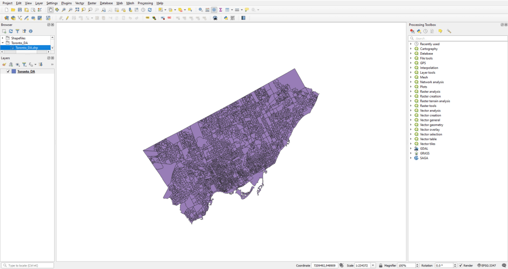
Power BI can only load topojson formats for a shape map, so first you will have to convert your shapefile to topojson. One way this can be done is by using QGIS. The next slides will show how to use QGIS to convert a shapefile to topojson.
- Load your data into QGIS. The following example uses 2016 “Dissemination Area” shape files for Toronto from Statistics Canada.
***IMPORTANT***
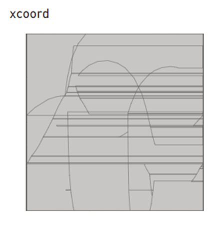
The conversion process that you will work through requires the ESRI .shp file you just loaded to be using the EPSG4326 coordinate reference system (CRS). If you are using a different CRS, your TopoJSON file will look unrecognizable.
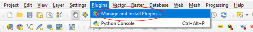
2. Click on “Plugins” and select “Manage and Install Plugins…”
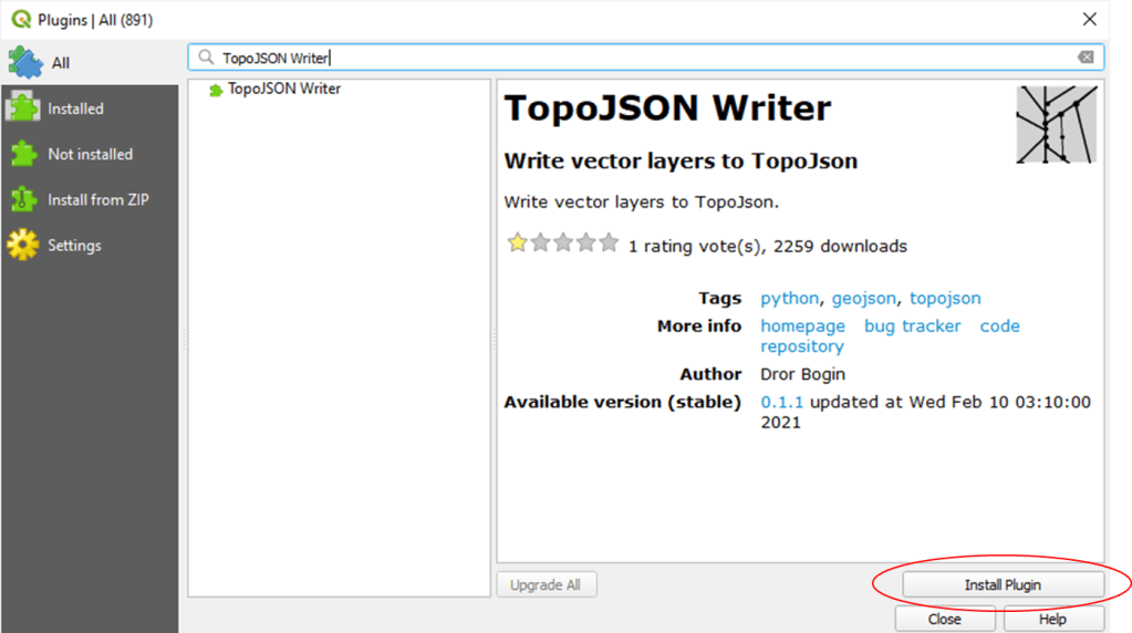
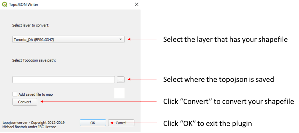
3. Go to “All” and find the “TopoJSON Writer” plugin and click “Install Plugin”
4. You may have to restart QGIS to see the plugin, but it will appear in the plugins area on your toolbar. Click on the TopoJSON Writer icon.

5. In the TopoJSON dialogue box, use the following settings:
With your shape file converted, you are now ready to use it in Power BI, which will be the focus of the next post.
WConley.ca
Moving from Analytics to Action